
SEO Benefits of Responsive Web Designs
January 2013 – Last spring Google posted about Responsive Web Design on their official webmaster central blog and though the flavor of their article was fairly mild, they made it very clear that their “commitment to accessibility” includes a very important message to web designers – “Mark up one set of content, making it viewable on any device.”
Google prefers a canonical URL and doesn’t like messy redirects.
About 15 months ago we saw drops in rankings as a result of using a particular WordPress plugin that allowed for an easy addition of a mobile site. Even though we had already begun building our new sites with responsive, we needed a cheap “fix” for older clients, especially those on maintenance budgets. We learned the lesson quickly however, that the plugin was redirecting to a mobile URL, which looked to Google like some sort of shady cloaking. After the plugin was removed our rankings jumped right back.
Do Responsive Sites Rank Better?
Why yes, as a matter fact they do, and here’s why…
Link Concentration
When links are built to a website, they stick to the domain to which they point. You can change hosting and where you point your DNS, and all the links to that domain will remain connected to the domain name itself. That’s one reason you sometimes see very high auction prices for domains in GoDaddy. Essentially people are buying a lot of existing links for a relatively inexpensive price.
The point being, if you have multiple access points for web visitors (a mobile site hosted elsewhere or on a subdomain) you will be dividing up your web power currency, and links are the number one factor for Google to determine where to rank a website in search results for competitive search queries.
Pro tip: If you have subdomains or pages that you’ve gotten rid of or plan to by switching to a responsive design, be sure to 301 redirect them to equivalent pages on your new site. That way you’ll collect any links previously sent to those now orphaned pages, as well as about 90% or the pagerank flow.
Link Integrity
With a responsive site, when your site is linked to from Facebook, Google+, and other social networks, visitors following those links will always end up at a page displays correctly for their browser. If you decided not to go the responsive route and someone shares a mobile link that is later viewed on a desktop, you’ll have some interesting redirects with which to work, a less than perfect visitor experience, or worst case, broken links.
Time on Site
Another ranking factor that Google’s algorithm uses to determine the quality of your website’s content and overall user experience is just how long visitors spend reading, viewing, or interacting with that content relative to other similar pages on other sites.
Now, you can have a site with a responsive theme installed and not set up, but done correctly, a responsive site will look far better when viewed on phones or tablets, that’s the whole point.
Google even says they’d rather “never show a horizontal scrollbar, whatever the window size.” This is yet another strong recommendation from Google to design responsively.
Credit for All of Your Content
All else equal (and often not so equal) large websites beat out small websites in ranking results. Unfortunately, Google doesn’t index iPhone apps. Apps aren’t a bad idea at all. They often offer great user interface and functionality, but what you don’t want to do is eliminate your mobile content from Google’s index by moving it all to an app. The good thing about mobile apps not being indexed is that you don’t risk duplicate content penalties by having both an app and responsive mobile site.
Liquid Layouts
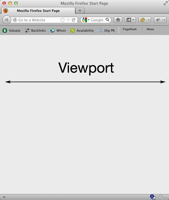
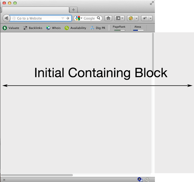
If you’re a designer ready to take a responsive test drive, you’ll want to start with liquid layouts. Liquid layouts define all the containers on a website by percentages, which allows them to resize fluidly when you change the window size. They are based on the viewport, rather than the original containing block.
Responsive Themes for WordPress
If you’re on WordPress or are considering a switch there a ton of options available to install ready-built themes with responsive capabilities built in. You’ll be responsible for some of the markup, defining logo sizes, and often using shortcodes to organize your responsive theme, but all the heavy lifting is already done for you. Checking out a responsive theme is also a great way to get acquainted with responsive coding.
We like ThemeForest for premium themes, and you can search WordPress.org for themes tagged “responsive” or check out our list of very good-looking free responsive WordpPress themes.
When designing responsive you’re building a better user experience and also developing a site that is significantly more future proof. As more sites move to flexible layouts and the percentage of mobile web users continues to grow, sites lagging behind will see a decline in search rankings.
Ryan Howard is the search strategist and owner of the professional SEO services company, CWR, which builds responsive WordPress websites, architects SEO campaigns, and develops eCommerce marketing solutions.